Tips for drawing white fur in pastels
When drawing realistic white fur in pastels there are a few key things to consider.
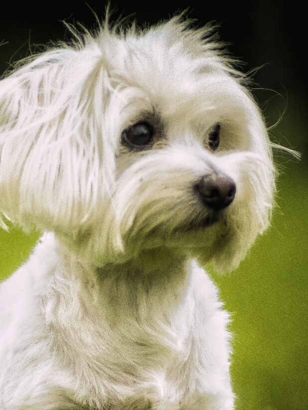
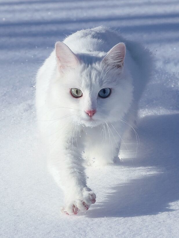
1. White fur is never truly white
This goes for anything white; fur, feathers, scales etc.
White is very reflective so it will pick up colours from the surrounding environment. An example of this is if a white dog is led on grass, some parts of the fur such as the chest and muzzle area will have a green tint.

2. Subtle tones
White fur has a vast range of tonal values that we need to capture in order to maximise the depth in the portrait. It’s just as important to focus on the midtones as much as the highlights and shadows.
Even when drawing white fur on white paper, the animal should still stand out. This is because the fur will always have a value to it. It won’t ever be bright white. The only exception would be if the photograph was over exposed and in those cases that kind of photograph is not usually best suited for portraits.
3. Layers
This is something I speak so passionately about in my real time tutorials. The number of layers and how we order those layers is crucial. We often think of white fur as one colour but as points 1 and 2 demonstrate, that definitely isn’t the case. Therefore, white fur requires the same attention to the layering technique as any other fur colour. We shouldn’t just be working with 2 or 3 layers and expecting the fur to look realistic.
The number of layers will vary depending on the type of fur, feather or any element we are working on. Longer fur that overlaps like this cat tutorial takes anything between 10-12 layers if not more.

TIP: Don’t be scared to go dark. White fur often ends up far to light as we may be worried about not being able to lighten darker tones. Pastels are incredibly versatile so we can correct darker values if needed.
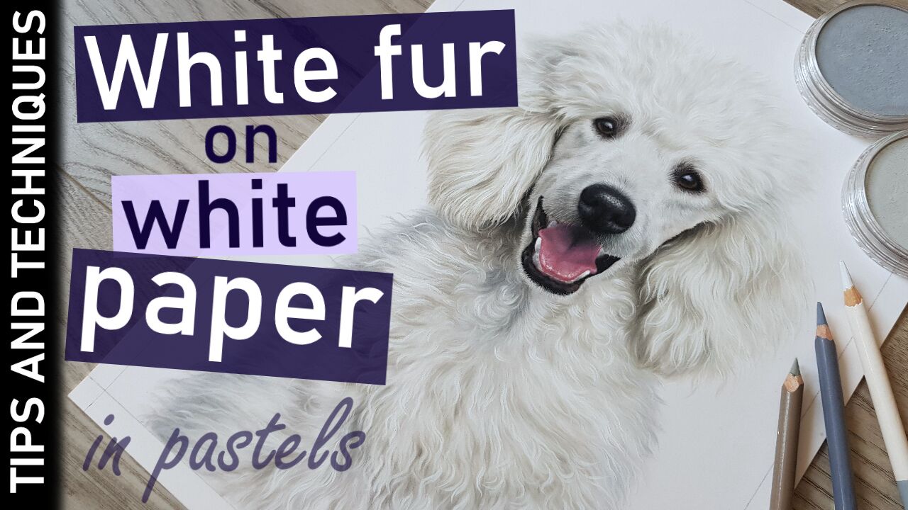
I have a white Poodle tutorial on YouTube which is packed with tips for drawing realistic white fur in pastels. Click the thumbnail below to watch now =).