What makes for a good reference photograph?
When creating photo realistic art, working from a good quality photograph is crucial. There are a few key factors to consider when choosing the right reference photos.
1. Lighting
This is something that can make or break an image. Poor lighting can make the subject appear flat, dull and uninteresting. Good lighting however, creates more shape and form therefore more striking images. A one sided light source or light that creates sharp contrast will result in a more three dimensional looking portrait if we capture these values correctly in our artwork.
2. Quality
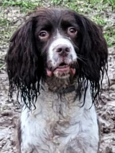
This is a issue many pet portrait artists will run in to at times. Poor quality reference photos lack detail, are often to dark, the subject is to far away or the image is just to small so becomes very pixilated when zooming in.
Working from poor quality photographs can be done however the finished portrait is unlikely to be as realistic as a portrait created from a good quality image.
If detail cannot be seen then it can become a bit of a guessing game.
If an artist is new to their art journey, it’s best to work rom the highest quality photographs. If the right supplies are used and we have the best quality photograph, it enables us to use the very best techniques. The more confidence an artist gets the more they paint or draw will enable lower quality images to be used but it is personally something I try to avoid when possible.
3. Angle
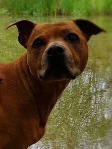
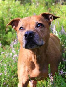
The way a photo is taken also effects the impact a painting or drawing has. For example, photographs that are taken of an animal at a higher angle, often makes the nose look unusually large.
Someone who looks at a photo trusts that it’s right because a photo doesn’t lie. But a drawing of that angle could result in questions such as ‘has the artist drawn the nose wrong?’.
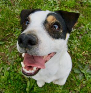
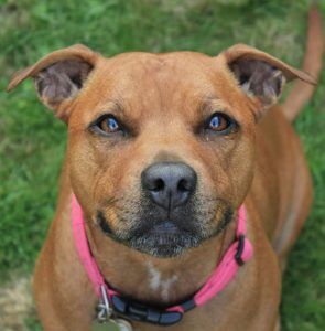
That being said, different angles can create interesting compositions so it’s just isolating what works and what doesn’t. Both of these images are higher angles. The Jack Russell photograph feels like it’s made the facial features to pronounced whereas the Staffordshire Bull Terrier still has nice proportions. This really can depend on each artists personal preference and there is no right or wrong choice.
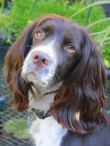
TIP: Photographs taken at a lower, eye level view usually work really well for pet portraits. A slightly side view is my preference but here are a few examples of images I feel would make for ideal portraits.